We've been watching a fascinating series on TV called Great British Photography Challenge, in which a group of 6 photographers are given assignments to photograph a particular genre within a certain time. We've watched them tackle nature, sport, a fashion shoot, abstract, landscape, an advertising pitch and flowers. Afterwards a professional photographer gives encouraging feedback that also highlights improvements and what didn't work in the photo. I've learnt so much from all this, although I obviously will never be invited to do a fashion shoot!
So, armed with this new knowledge and a whole lot of enthusiasm, we set off for Hindmarsh Falls. Here are some of my photos and the tips I was trying to adhere to.
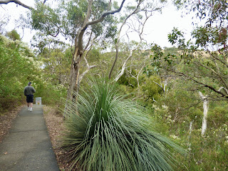
1. Always look for something different. Don't shoot a 'postcard', that is, a wide-shot that just shows what a place looks like. Yes, you may take one of these to remind you of where you went and there's nothing wrong with that, but look for a different angle or subject that still retains the essence of the place but makes the viewer see it in a different way. My example shows the kind of photo I often take, then another one that shows the bush in a different way.
2. Look for something that catches the eye. I like my leaf example ...
... but this dead stuff didn't look as interesting as I thought it would.
This bark photo is ok but then I remembered that first lesson...
'Always look for something different' - so the bark became a border and the background out of focus but suggesting the bush - a bit like that first shot I took.
3. Take a photo from a different angle. You might look up, or down, or through or from behind a subject. This example isn't exactly what is meant by 'a different angle' but I couldn't quite get behind anything, so I just looked up.
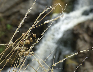
4. Look around for a different perspective. Then see if you can make it better by looking for another angle or composition. I think this works here. The first is perhaps a little different from an ordinary waterfall photo but is really just a straight on shot of the rock with the waterfall behind.
So I zoomed in to get a bit of the rock and the waterfall. I think it makes for a more interesting photo.
5. Go abstract when it feels like it could make a more intriguing photo than just a good representation of the scene. Here are my two efforts. The first one is fungus on a rock.
6. A good tip is to have something in the foreground in focus and the background out of focus. A few of my efforts didn't work because my camera can't get too close to a subject so everything was out of focus! Try again.
Not bad. And again. I was getting the hang of this.
One more try.
I think I like this one the best.
7. Look for something quirky or humorous that will catch the eye and make people smile or say, 'Why didn't I think of that?' I tried but it has to come naturally. I'm sure a professional photographer would do it much better, but the idea is there.
And finally ...
8. What someone feels about a photograph is subjective - we don't all like the same thing. But regardless of this, the photo should arouse an emotion in the viewer. They don't care that you've waited 4 hours to get the right light or had to lie flat on your back or were lucky to have a koala suddenly appear ... they just know that the photo is a good one. My example here might not appeal to everyone but it may make you think - yes, I quite like that.
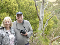
And here are the intrepid photographers, taken by a kindly passerby.
******************************************
On the way back home, we came across an abandoned farm building. Here is a 'photo essay'. I tried to put all those tips into practice - with varying degrees of success. But I did have a lot of fun. The first photo is what is called an 'establishing shot' showing the subject matter, just like a 'postcard'; I used the lovely old gum tree as a frame, and the long stretch of golden grass with a glimpse of road in the foreground to emphasise the building's isolation.
Closer, taking advantage of the greying clouds to give it a bit of 'atmosphere'.
And a different view using the wheat in the foreground.
Another quite different view showing a glimpse of the building through the branches of the old gnarled gum tree.
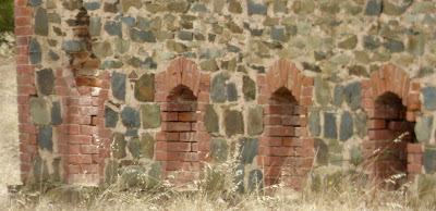
And now for some detail. Luckily my camera has a fabulous zoom lens so I was able to get quite close. These photos reveal to me the builder's beautiful attention to design and skill in using local materials. The construction has withstood years of abandonment, although the building is now gradually succumbing to the ravages of time.
I was fairly happy with these photos, but took one last one as I walked back to the car, as the clouds were looking even more menacing than before and the hidden sun gave the building a rather melancholy air I thought. It's similar to the earlier photo I'd taken but I took in more of the landscape.
A satisfying day of photography. I'm still learning, but feel more confident, thanks to that inspiring (and helpful) television program.




Have you thought of writing training manuals... Your skill shines through here.
ReplyDeleteAnd aren't the stone, red quoined buildings truly iconic of SA. Beautiful. XXXX